Part I: The Head | Part II: The Body | Part III: Clothing & Shading
Okay, we're on to drawing Katie's body.
WARNING: At some stages throughout this discussion, there
WILL BE NUDITY.
I'm sorry about that, but it can't be helped; if
you wish to learn to draw the human body correctly, you have to know what
it looks like first. If you don't want to see nudity, you should leave
now. In the end, Katie will be fully clothed; but below, she may
not be. I'm sorry about that, but it is necessary.
| |
Click image to zoom in
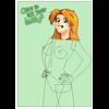
 | | 8. Set up the basic pose in the next hour (plus)
By now, you should already know in your mind exactly what the character's
pose should look like. In Katie's case, it has to be spunky and defiant;
a classic "I am woman, hear me roar" pose. That means that she'll be
standing with her arms akimbo, hands on her hips, her chest and hips
forward relative to her head. Her feet are going to have to be back
slightly, underneath her head, to ensure that she stays balanced and
doesn't fall over.
There are three good ways you can ensure that you pose a character
correctly:
- Method #1: Have a real live person stand in exactly that
pose and then draw them. This is the best way to do it, but it is
probably as impractical for most of you as it is for me.
- Method #2: Use reference photographs. You can buy books
at your local bookstore in the art section that are basically just
pictures of naked people standing/sitting/laying in various poses,
taken from various angles. These are great books, but they're also
expensive. If you're on a strict budget, you can try various
pornographic web sites, but be prepared to do a lot of searching to
find somebody with semi-normal proportions in the pose you need.
- Method #3: Use an artist's manikin. This is a little
posable wooden doll, about 12 inches (30 cm) tall. These are sold
by many art stores, and they're pretty cheap ($5 to $10 each).
They can help you keep your proportions and angles correct; however,
if you don't know what the body should be shaped like, this won't
help you that much. Manikins are very useful for experienced artists,
but only marginally so for beginners. The best thing they have
going for them is that they're cheap.
It is reasonable to use combinations of the above methods as well;
many artists will pay a model for a photograph of a particular pose,
while others will mix-and-match bits of reference poses in a
Frankenstein-esque method of constructing a final pose.
In this case, I'm going to use an artist's manikin combined with
some bits and pieces of reference photographs (mainly for her torso,
arms, and hands). Unfortunately, I can't reprint the photos here,
but you'll get much of the idea from the position of the
manikin.
|
|
| |
Click image to zoom in
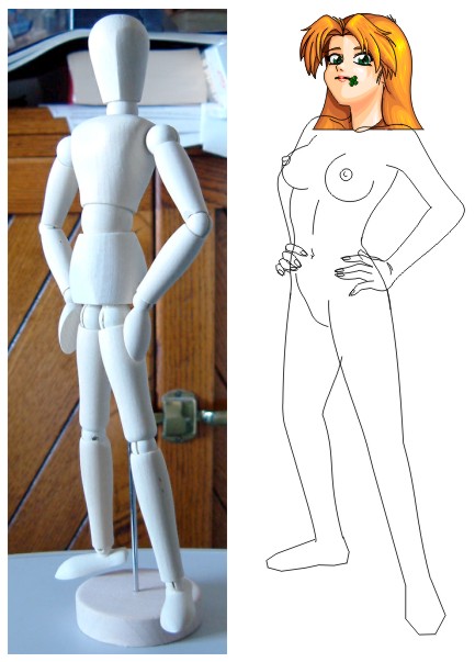
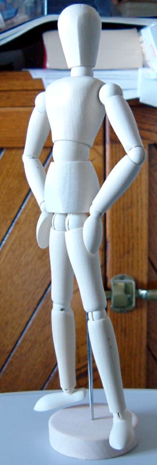
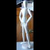 | | In case you haven't already clicked on it, this is the manikin, in
approximately the pose we want. We'll probably put her hands a little
higher on her hips than that, but this gives us the basic idea. |
|
| |
Click image to zoom in
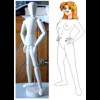
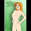
| | From the manikin's pose and from the reference pictures, you should
arrive at a quick sketchy pose that looks something like this. We'll
clean up the lines later; for now, it's enough just to get the basic
position correct, just as we started with a rough guesstimate for
the head. Some of the body parts are fairly well defined at this
stage, while others (like her hands) are just shaped rectangles and
triangles. It can sometimes help when doing this to first lay out
the limbs in stick-figure positions and then draw around the sticks
to flesh them out. |
|
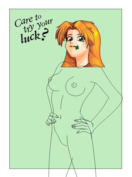
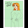
| |
Click image to zoom in
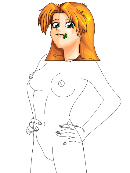
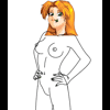 | | Hard to see what she looks like in that previous picture? Here's just
her body, cropped to the part we'll most likely keep in the final image.
In just a few moments, we'll put some clothes on her, but it's important
to see what her body is shaped like before we add the clothes. Clothes
are not just painted on; they cover the body, and they have
thickness, and they follow the contours of the body underneath them.
So if you don't know what the body actually is underneath, you'll never
be able to get the clothes in the right positions. This is why we even
go so far as to draw nipples; although you'll never see them in the
final image, because they'll be quite covered, the clothes are
going to still follow their shape, and although you won't directly see
them, their existence still needs to be hinted at for accuracy. You'll
see more about this when we get to the clothing below.
|
|
| |
Click image to zoom in
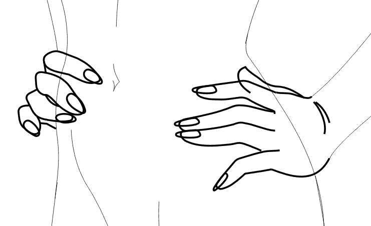
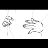 | | All about hands. Well, folks, hands are hard, and are worthy of a full
web page all by themselves. These hands are in a particularly awkward
pose, and not one that a beginner should dare (if you're starting drawing,
start with simpler hands, with palms open, or a fist, or a finger or two
pointing; these are braced against other surfaces at awkward angles, and
getting the proportions right on these can take hours even if you know
what you're doing). Thus rather than go into great detail as to how I
got these to be what they are, I've simply highlighted them here. Maybe
in the future, I'll do a full page on hands, but for now just accept
them as they are here. |
|
| |
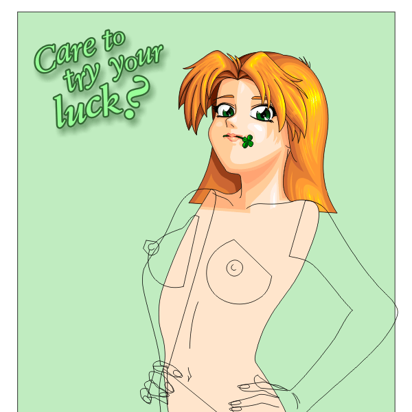
Click image to zoom in
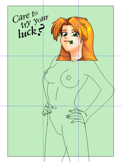
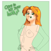
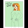 | | 9. Crop the picture and make a basic background in the next hour
Okay, so we have this great picture of Katie, but where do we cut it
off for the final portrait? It has to have the text on it, beside
her head and a little above, so that it hints at a title and at a saying;
it has to have enough whitespace surrounding her as well; and it has to
have proper balance. In this case, the picture will have portrait
shape, meaning that the height will be roughly 1½ times the width.
I'm going to teach you a secret known to professional artists, called
the rule of thirds. This rule helps ensure balance in your
picture, and that you have enough whitespace (empty space) in the right
places.
|
|
| |
Click image to zoom in
 | | How does it work? First, divide up the picture on lines at 1/3 and 2/3
across and also down, like this. The focal point of the picture --- the
most important spot in the picture --- should be at one of the
four intersections of those lines, or reasonably close to it. Those four
intersections are the points in every picture to which the eye
is naturally drawn. The lines divide the picture into nine rectangles,
and the rule says that for proper balance, we want to have at least
three to five of those rectangles empty (or mostly empty), and that if
at all possible, three adjacent rectangles should be empty.
Here, Katie's face obviously should be the focal point, and it's fairly
close to the upper-right intersection, which is actually on her neck.
Thus the eye will initially be drawn to her neck, which is actually good;
by forcing the eye to start at her neck and then look up to see
her eyes, we make it look like she's just a little bit taller than the
viewer, which helps to enhance her apparent ego. We've left three empty
rectangles in a column the left (the text won't count, because it will
be green by the time we're done), which is good, and the upper-right
and lower-right rectangles are also mostly empty, so we have almost
exactly the right amount of whitespace too. If we included more of
Katie by making her smaller, we could then put her face right at the focal
point, but then we'd have too much whitespace; and if we zoomed into
her face, we'd end up with too little. This is almost exactly the right
balance, carefully defined for us by the rule of thirds.
Why, then, do we cut off the tip of her left elbow? Glad you asked.
The answer is that while we could shift her left a little to allow
enough room for it, it would look wrong. The eye does not
expect any part of the picture to touch the edge. You can
use the central area of the picture all you want; and you can make
things that cross over the edge; but you can't touch the edge.
Thus we shift the tip of her elbow off the edge just slightly to
ensure that we're crossing the edge and not touching it. It's better
to go a little over the edge than a little under it, every time.
|
|
| |
Click image to zoom in
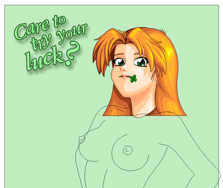
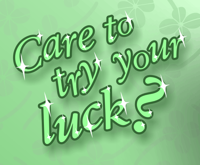
| | We should talk about the text a moment before we go on. The text is
a window into Katie's mind; she's not saying it, but her look indicates
she could say it. It also serves as the title of the picture.
Thus we want it to look right. Initially, it's simply typed in, just
as you'd expect; the typeface is Class Garamond BT, and the font uses
the italics version of the typeface. The text needs to take up about
half of one of the rectangles, so that determines its overall size and
placement. So what about the letters themselves?
Each letter is specifically sized, rotated, and bent to maintain balance.
The word "luck" is the most important word, so it's larger than the rest.
Each letter is shifted slightly askew so that it looks more like
off-the-cuff thoughts and less like stolid static printed text. Notice
that if you ignore the dot of the question mark, the "C" and the
question mark are almost the same size, though the question mark is
denser; this helps maintain balance, but draws the eyes toward the end
of the sentence and the important word "luck". Getting the text right
requires pracice, and an eye for aesthetics, and nothing more.
|
|
| |
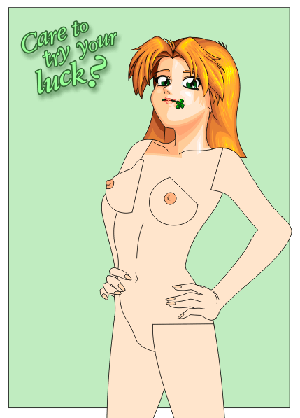
Click image to zoom in
 | | Here's the text, completed. Notice that by making it shades of soft
gray-green pastels, it blends into the background and almost becomes
whitespace. It looks as though Katie is standing in front of it, and
there's nothing to indicate that except the colors; in fact, if one
went by shadows, it might even be in front of Katie, since it has that
deep drop shadow. Getting colors right for background objects is very
important. We'll draw the rest of the background later; for now, we
have enough finished that we can start working on Katie herself again. |
|
| |
Click image to zoom in
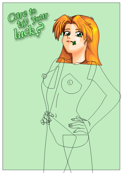
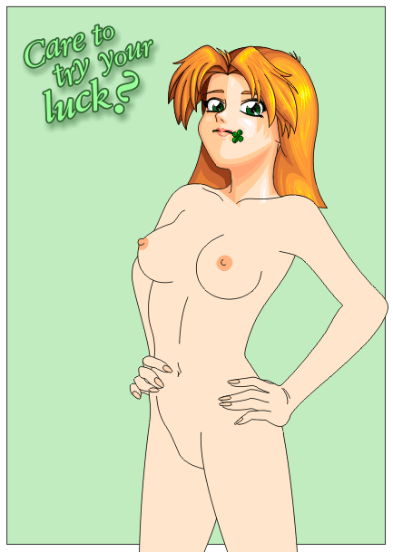
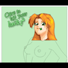
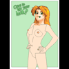
 | | 10. Close and fill the body the next hour
Right now, Katie's body is just a collection of lines. We need to go
from that to a body filled with a solid peach color. So the first step
is to do what's shown here, which is to figure out what the individual
stackable objects are and to close them. Her torso will be one, for
example, with her left arm and left leg as separate objects on top,
and right arm and leg in back, her right fingers in front, and so on.
We take each object and join its lines together and then close the
shapes. We want as few lines as possible crossing visible surfaces,
and ideally, we want them covered up. In this case, all of the
crossing lines will be invisible, because they'll be covered up by
her clothes. If she were to stay nude, we'd have a visible line on
each leg, each breast, and each shoulder. You'll see that better when
we actually get around to closing the body's shapes.
|
|
| |
Click image to zoom in
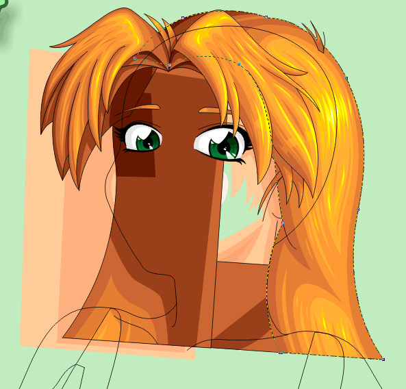
 | | There's an interesting problem that occurs at her neck, because that's
where we have to join the finished head to the unfinished body. This
gets a little delicate, but the basic idea here is to ungroup the
pieces of the head, break apart the neck without losing the shading
objects placed inside it, and join it to the torso. Above you could
see the "before" picture; here is the "after" picture once the neck
is correctly attached. This picture shows the midway point of the
joining, but it also illustrates an interesting problem that often
appears in pictures like these: What goes on top, the hair or the
head?
Take a close look at the picture. Look at the highlighted line around
the hair (look at the zoomed-in version). This object must go on top
of the head, obviously, but it must go behind the body, and since the
head is going to be joined to the body, we arrive at a Catch-22: This
shape has to be on top and underneath simultaneously! How do we
resolve this dilemma?
|
|
| |
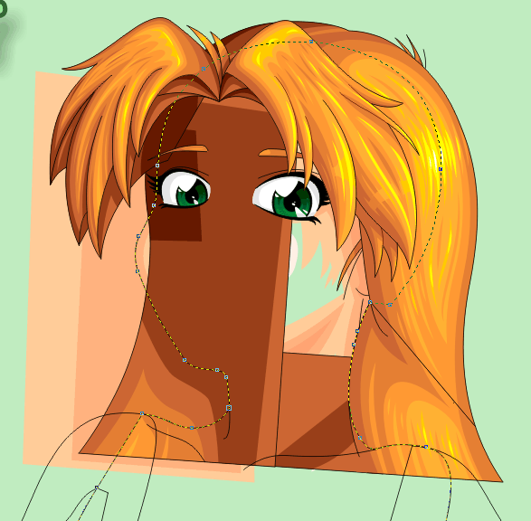
Click image to zoom in
 | | The answer is that we need to split the hair into two objects, and use
some cleverly-placed colored boxes to hide that we did it. The hair
provides a natural split line, too, right down the line where the
hair wraps around at her neck. See the split in this picture? To
make that split, we first add nodes at the endpoints of the line on
the hair; then we make a copy of the hair. One copy will have most
of its points cut away to just show the bottom part, and the other
will have the points from the bottom part cut away, leaving what you
see here. Note that we also had to "dent" her head near her neck
to complete the effect --- proof that it really doesn't matter what
shapes you use so long as the eye is convinced of the end result:
Katie's head has a dent in it, but nobody will ever know because the
dent will be covered up.
|
|
| |
Click image to zoom in
 | | Here we've moved the trailing part of her hair to the back; the rest
is on top; the body and face are joined and filled, and the ugly splits
are covered up by hair-colored boxes so nobody can see them. Thus the
head/torso part is done.
|
|
| |
Click image to zoom in
 | | Now we quickly go through and shade all the rest of the closed objects
with skin color. This is quick and easy. Once they're shaded, we
adjust the stacking to make sure that things that should be on top are
on top, and things that should be behind are behind. We also take
advantage of the fact that we're cutting down objects quickly and
place several of the various wrinkle marks (belly button, wrist,
neck, etc.) inside their respective objects to keep things organized.
|
|
| |
Click image to zoom in
 | | Even though we'll never see the cut lines, because they'll be covered
by clothing, the cut lines can be very distracting when drawing the
clothing. Thus we'll now add a handful of extra objects to cover up
the cut lines. These are basically just a few skin-colored rectangles,
but you can see what a difference they make!
|
|
| |
Click image to zoom in
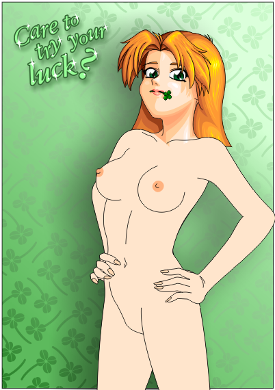
 | | 10½. Finish the background (slightly less than an hour)
Normally, the rest of the background would wait until step 15, "Touch
up and finishing details," but because I've been writing this text
throughout the drawing, it's been taking forever, and I felt like I
needed to reward myself. So I drew up the rest of the background,
and added a few finishing details on the text. Can you see what I did
before I tell you what I did?
|
|
| |
Click image to zoom in
 | | This is the text, close up. The only change here is the addition of
little white sparkly things in just the right places. They're all on
the side of each stroke closest to the light source; they're all
facing the same direction, and their size is dependent on the
thickness of each stroke they are placed on. After the image is
finished, we'll make one more change here that will give it some
additional necessary verisimilitude, but in the interim, this looks
pretty good already. (Why sparklies? That's easy. Katie's Irish.
Ireland is the Emerald Isle. The sparklies make the text
look like it's made of emeralds. 'Nuff said.)
|
|
| |
Click image to zoom in
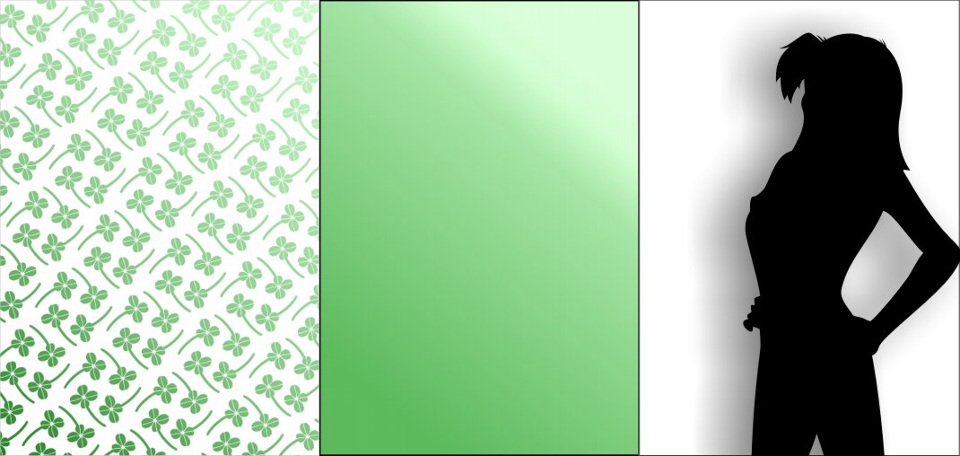
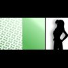 | | We can get away with a fairly simple background, since Katie herself
is the real focus of the image. The background is nothing more than
these three objects, overlaid, with Katie herself covering up the
black object controlling the drop shadow. The clovers are simple
outline shapes merged and fountain-filled, and placed inside the
fountain-filled rectangle. The fills have been chosen so that the
corner nearest the light is fairly light, the corner farthest from
that is a rich dark green, and there is a band in the middle of
gray-green so that the text stands out. That's pretty much all it
takes, since the background really doesn't need to be anything
super-significant. |
|
<< Prev: Part I: Drawing the Head
Next: Part III: Clothing and Finishing Touches >>
Copyright © 2003-2017 by the Phantom Inker. All rights reserved.