Part I: The Head | Part II: The Body | Part III: Clothing & Shading
Clothing, shading and finishing touches.
| |
Click image to zoom in
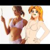
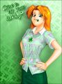
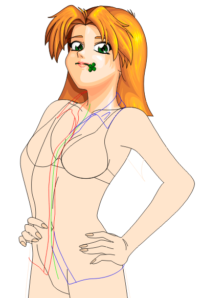
 | | 11. Finally, put some clothes on her! (three hours)
It's about time! Poor Katie's been standing there naked for
far too long, and now we'll finally do something about that.
The first step is to go shopping... sort of. You'll need to know
what kind of clothes the character is supposed to be wearing before
you can draw them. In Katie's case, she's wearing a plaid top of
some kind with an embroidered clover on it, and a green skirt, and
that's about all we know, so we have some improvising to do.
(Note that in some cases, depending on the picture, you may actually
be able to start with clothing on the character, particularly if the
clothing hides much of the shape of the body. This was particularly
true in the case of my portraits of Anne Onymous and Lilly Onymous
(and to a much lesser extent, Mingmei Wu); in their pictures, the
clothing covers so much of their bodies and is sufficiently poofy (Lilly's
by design, and Anne because of the wind) that I did little more than
a very rough sketch of the shape of the body underneath, and in many
cases the sketch was incomplete; Anne, for example, has no torso --- just
a neck, stomach, and arms --- and her clothing hints at the rest of
the shape. However, if you want a character to look sexy and shapely
in the final picture, or the clothes are tight-fitting (as with the
portrait of Cassie), you'll need to actually draw those parts and then
bend the clothes to them as we're doing here.)
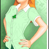
When I look at Katie's pictures in the comic itself, it's hard to
tell exactly what kind of shirt she's wearing. It looks to me like
it could be a pullover top of some kind; but the split at the bottom
suggests it's a button-up shirt. The way it hangs on her (and the fact
that it's a printed plaid) also tends to suggest that the fabric is
fairly thin, which is characteristic of button-up shirts and not much
else. However, the embroidered clover logo argues otherwise. So I
turned to various shopping web sites and see what kinds of shirts and
blouses they sell for comparison. The only ones with a split base
like that are button-ups, so I decided it's a button-up shirt with the
clover embroidered in two halves across it. That's a little unusual,
but not impossible.
The skirt is pretty straightforward; it needs to be above her knees
only so slightly and a solid green color, and there are lots of web
sites selling those.
The trick here is to visit various clothes-shopping web sites and look
at various catalogs until you see clothes that are similar to what you
want the character to wear, and then use those pictures as photographic
references when drawing the picture.
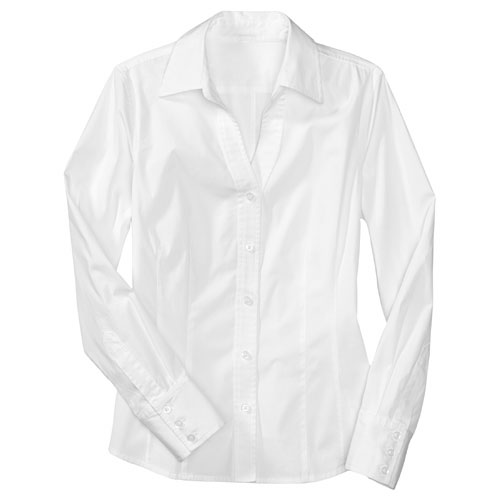
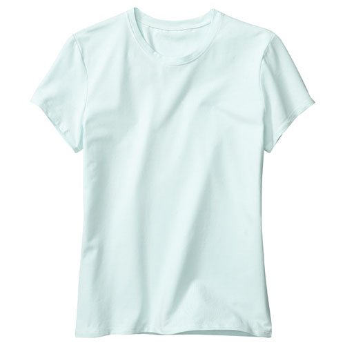
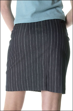
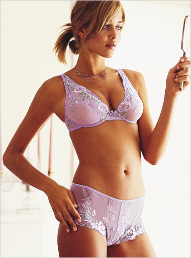
I "bought" Katie's clothes at the Gap,
Victoria's Secret, and at
Karmaloop since those looked like they
would look good on her. We have this
shirt (Gap) for the basic style, but we want it to be short-sleeved
like this T-shirt (Gap). Obviously
we're going to have to make it plaid, but that will wait until later; right
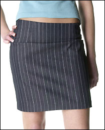
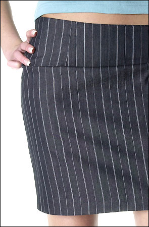
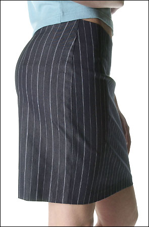
now, we're just choosing shape and texture. She'll
have on this skirt (closeup / side / back)
(Karmaloop/Betty Blush), colored green, of course. And last, but not
least, Katie will be wearing undergarments, which will change the shapes
slightly as well; specifically, her bra will flatten out her breasts a
little. We'll presume that she
has on this bra (Victoria's Secret),
since the model in the picture is in a somewhat
similar pose and that will help us get the shapes right.
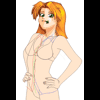
|
|
| |
Click image to zoom in
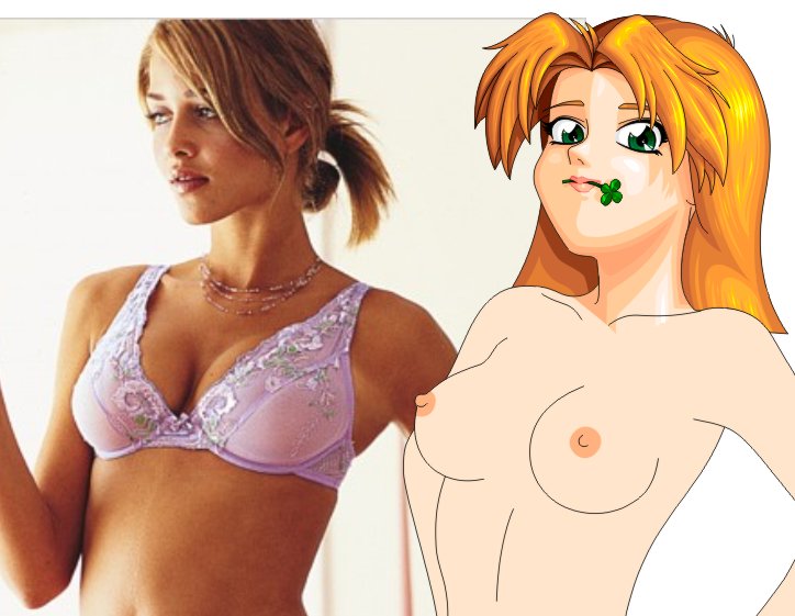
 | | First things first. Katie's shape is pretty normal for nude, but
since she wears underwear, we need to change her shape to fit that.
This is Katie lined up with our bra model, and we can see that the
big difference is that the bra squashes the breasts flat and lifts
them up slightly. This is why we made the breasts separate objects
before; now they can be easily moved without changing the rest of
the torso.
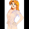
|
|
| |
Click image to zoom in
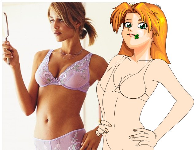
 | | Thus we arrive at this. Same shapes, same positions, only squashed
flatter by the bra. We are not going to bother to shade and fill
the bra itself, because if we do the rest of the clothing right,
nobody will ever see it. But do we need its shape to determine the
shape of the rest of the clothing.
|
|
| |
Click image to zoom in
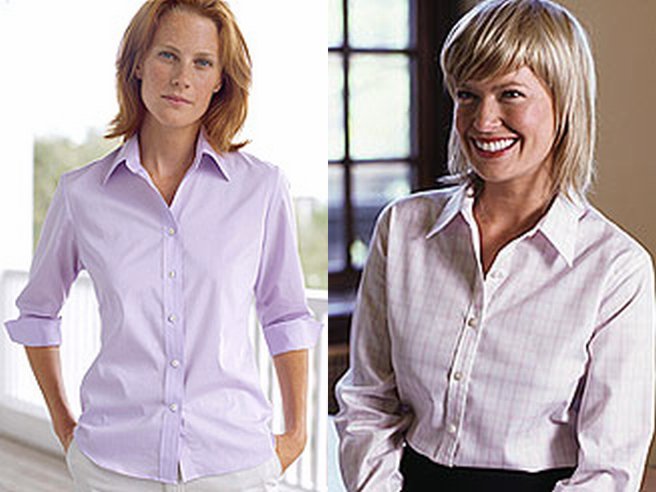
 | | The next step is the shirt. We have two pictures that show what we
want it to look like, so in theory, all we have to do is wrap that
cloth over Katie's existing shapes. In practice, it's not so easy
to do with just a plain shirt, so it helps to see somebody actually
wearing it or something like it. In these two photos
from Land's End,
we see two women wearing similar shirts. They're not in the pose we
need, but they do show where the wrinkles and shadows will appear in
the shirt. We will assume that Katie uses an iron, so that we don't
have to draw any more wrinkles in the shirt than we can avoid. The
wrinkles make it look more natural and realistic, but they're very
hard to shade, so we don't want any more than necessary.
So which wrinkles to draw? Look at the shirts in those Land's End
pictures. There are several important points to notice: First, look
at how the collar wraps around the neck. Notice where it
sticks out and where it curls around and where it curls under. Second,
notice the wrinkles at each shoulder that curl around to the armpit;
there need to be exactly enough there, but not too many, and they need
to follow the lines of the woman in the solid-color shirt, since her
elbows are sticking out. Third, notice how there are two lines of
shadows pulling at the top button in both pictures; these are characteristic
of these kinds of shirts, and we'll need to be sure to include them.
Fourth, notice that the shirt is fairly smooth near the breasts, but
below them, there's a semi-random pattern of wrinkles, particularly
in the solid-color shirt. And fifth, notice that there are wrinkle
lines running parallel to the sleeves on the solid-color shirt (I mainly
included the other shirt for reference for the collar, and for the
V-shape shadow at the top button). These are the lines we need, so let's
draw them.
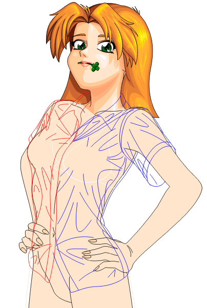
Thus we arrive at what you see in the picture (above and to the left).
The green line runs down the middle of where the shirt would go if it
were a solid piece of fabric. The red lines form the right-side collar
and hem; and the blue lines form the left-side collar and hem. Notice
how they carefully bend to follow the green line, and how there are
slightly pointy spots in the middle of her stomach; these are where the
buttons will go.
|
|
| |
Click image to zoom in
 | | Wrinkles wrinkles wrinkles! This is the rest of her shirt. With this
kind of clothing, the way you tell when you're done is when it looks
like the person is covered in cellophane. While there are a lot of
wrinkles here, not all of them will end up as lines in the final
picture. Some of them will be used to delineate shadows. I could
try to explain to you why each line is where it is, but really the best
way to understand this kind of clothing is to look at it. A lot.
I used several more photos from the various clothing-shopping sites than
I've mentioned here to acheive this result.
|
|
| |
Click image to zoom in
| | Alright, let's skip ahead a bit, since the intermediate parts here are
fairly tedious and fairly obvious. This is Katie with all her clothes on,
and flat shaded. There are lines to show where all the wrinkles are, and
they use a softened shade of green (instead of black), while the lines
for seams use genuine black. Much of this should be pretty obvious if
you look closely at the original photos for the clothing; however, there
are a few details to note. First, notice that the edges of the clothing
shapes must warp inward or outward when a wrinkle crosses them or approaches
them. Second, note that I didn't skip the seams or hems; they exist where
you'd expect to find them going down the side of the shirt and the skirt,
and at the sleeves. Third, notice that there are a few details that greatly
enhance the verisimilitude of the image: The buttons on the shirt (and
especially the almost-invisible upside-down button on the collar), the empty button-holes,
and the zipper on the skirt. You can't leave these kinds of things out or
your character will look wrong. You won't be able to put your finger on it,
but your character will look wrong.
|
|
| |
Click image to zoom in
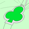
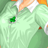
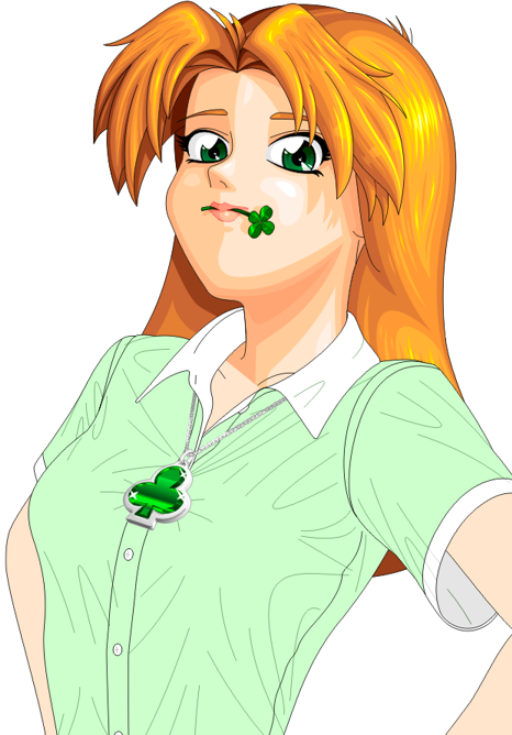
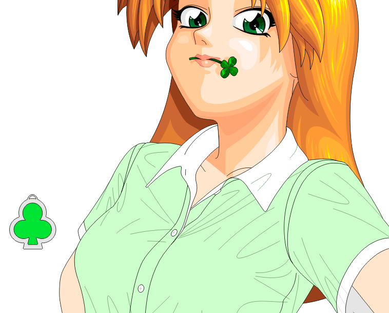
 | | 12. Accessorize!
Katie is pretty practical and doesn't seem to wear much jewelry or other
accessories (that I can see, anyway). However, there is the issue of the
clover on her shirt, which I learned is not embroidered, not stitched, and
not a pin; it is, according to her character designer, a pendant, hanging on
a thin silver chain. Cool. Now I could spent hours trying to explain how
to draw her pendant (it took about two hours to draw it), but I won't
cover all of this, because some parts of this drawing are better left to
the imagination. Instead, I'm just going to show you how I arrived at
the basic shape of it, and then show you the reference photos I used, and
leave the rest up to you.
|
|
| |
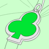
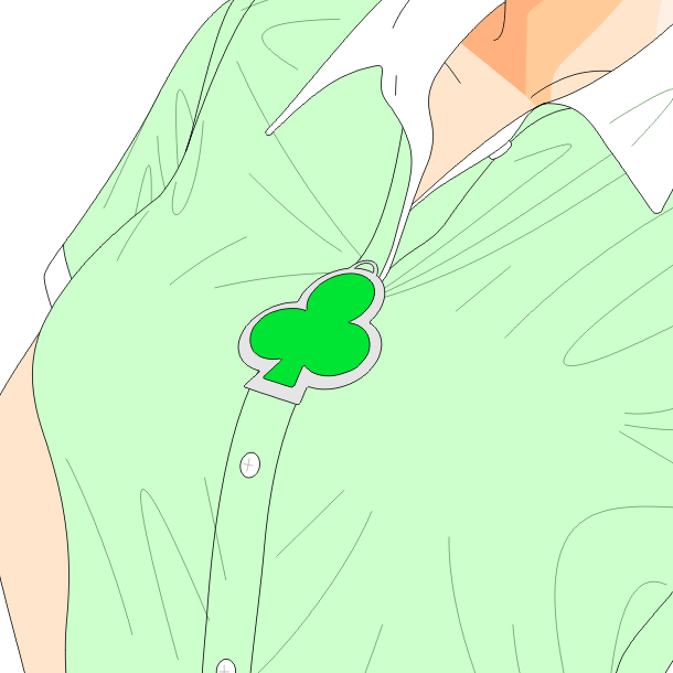
Click image to zoom in
 | | Alright, the basics are formed from this shape. This itself was generated
by welding some circles and a triangle together, coloring it green, copying
it and stretching it to yield the silver part, and then rounding off all
the corners. The loop on top is little more than just that.
|
|
| |
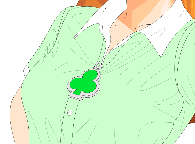
Click image to zoom in
 | | To get it into place, I grouped the green and gray parts together and
used the perspective-warping effect. Once I had the shapes about how I
wanted them, I converted them back to curves.
|
|
| |
Click image to zoom in
 | | Duplicating the silver part below and then stretching it at the corners
will make it look 3-D. The ring at the top is just a pair of combined
ellipses, cut where they look like they cross the loop of the pendant.
And that's really about it for the shapes.
|
|
| |
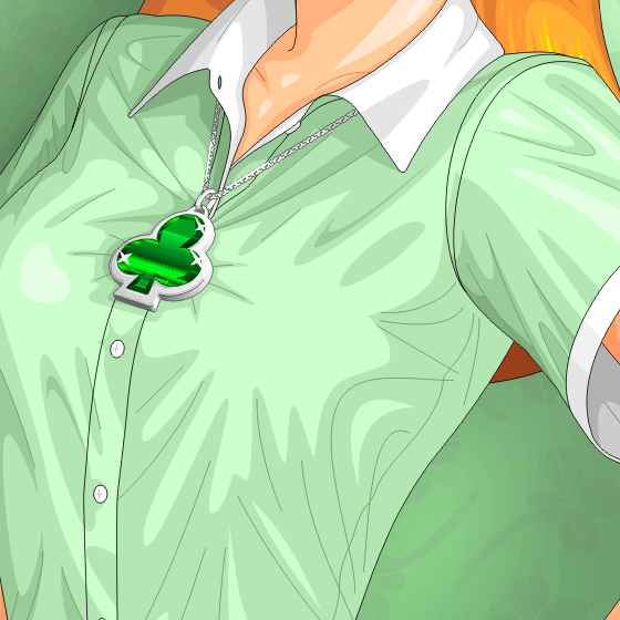
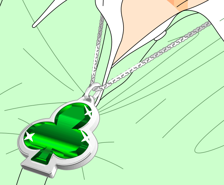
Click image to zoom in
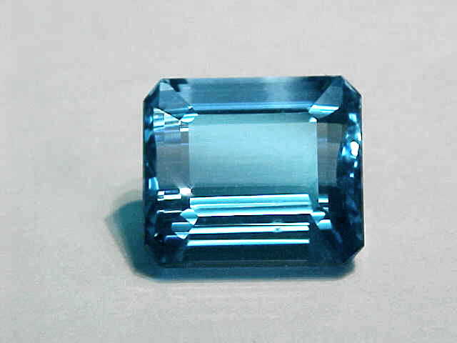
 | | So this is the final result. Most of this is accomplished using many
little shapes with custom gradient fills in them; even the silver part
of the pendant has a gradient fill. The chain is little more than a
whole lot of colored T-shapes with shading in them. It helps (a lot) to
look at real pictures of silver and precious gems; in this case, the gem
is tourmaline, which is a kind of quartz with greenish highlights --- an
emerald has whitish highlights, and at this size would be hundreds of
thousands of dollars, or more; as it is, Katie has about $3000
hanging around her neck, give or take a thousand bucks --- this gem would
be about 25 carats, I think, although the complexity of cutting such a
strange shape would probably add a bit to the price.
|
|
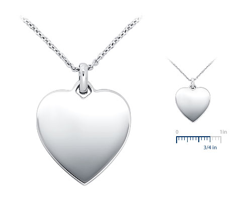
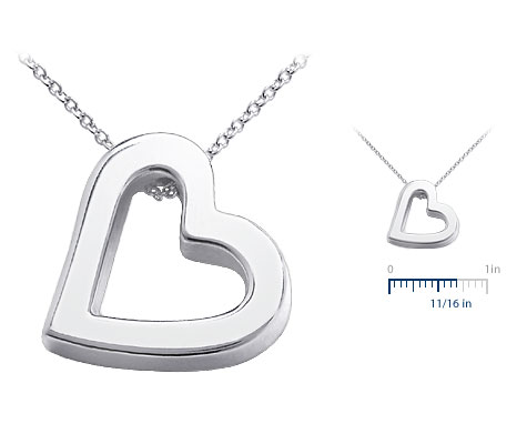
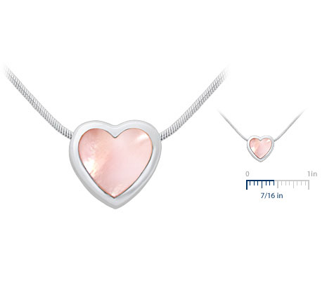
These are the reference photos I used:
heart pendant
for the ring and the chain and some of the silver;
open heart pendant
for a closer look at the chain and the coloring on the silver;
mother-of-pearl pendant
to see how silver looks when other materals are set inside it; and this
aquamarine gemstone to get the shapes and the
reflections right in her tourmaline gemstone. (Although aquamarine and
tourmaline are very different species of gems, they do have similar
coloring properties from an artist's perspective, so it's reasonable to
use aquamarine here for comparison.) All of these photos were obtained
at various shopping web sites: The gemstone(s) from
MineralMiners.com; and the
pendants were from
Blue Nile.
| |
Click image to zoom in
 | | 13. Shade the skin in the next hour
The skin is pretty straightforward --- albeit time-consuming --- because
we don't have any significant surface areas to deal with. Thankfully,
she's not wearing a bikini or naked or something like that, because that's
a nightmare to shade. Instead, we have a few little closed shapes, like
her neck and arms and hands, and we can shade each part individually.
|
|
| |
Click image to zoom in
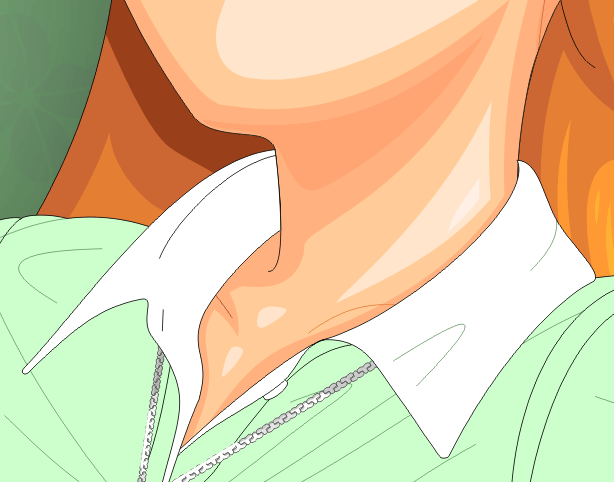
 | | Her neck and collarbone are pretty simple; we mainly continue the shapes
started above, and add a little extra shadow where the raised collar will
block the incoming light. There's not that much to say here other than
that you follow the lines of the neck and the collar and it's pretty hard
to go wrong.
|
|
| |
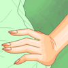
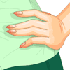
Click image to zoom in
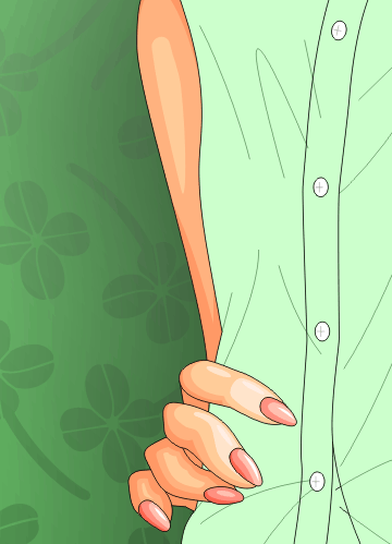
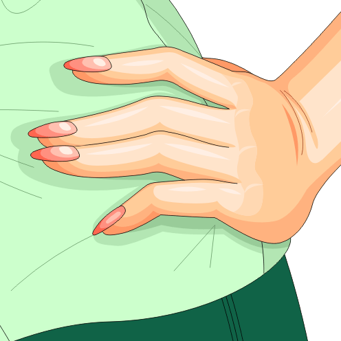
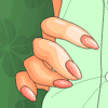 | | Her right hand is easier than her left. Her right arm is mainly just one
big dark wash with slightly brighter areas where it sticks out. The
palm of her right hand is just the darkest shadow available; and the
fingers are shaded individually. There's a bright part on the nearest
joint of each (although the ring finger and pinky are darker because
they're both farther back and the other fingers block their light).
The rest of the joints are darker, and the undersides are darker. The
fingernails are rounded and have a bright streak toward the light (except
for the ring finger, whose nail is pointing downward and thus is
darker).
|
|
| |
Click image to zoom in
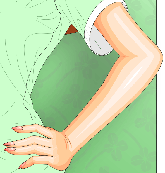
 | | Her left arm is a little harder, but the same basic ideas apply as with
the right arm. The arm itself needs to be shaded to look like it's
round, so that means shadows away from the light and highlights toward
the light. There's a little extra crease line at the inside of her elbow,
but very gently shaded so it does not strongly stand out.
At her wrist, things get a little more interesting. There are
alternating patterns of highlight and shadow at the wrinkles there, and
the lines for the wrinkles are softened to a dark brown so they don't
stand out as strongly. Counter-intuitively, the back of her hand is
shadowed, even though it points to the light source. Why? If the hand
were correctly shaded, it would be equally bright over most of its surface,
and it would look flat and short; by putting this part in shadow, we
convince the viewer that the palm is at a separate angle from the fingers
and is wrapping around her waist. The shadow makes the palm look bigger
than it really is.
Last, but not least, we shade the fingers, just like we did on the
right hand. The fingers are mostly brightly-lit, but the shine on the
nails points the other way since the light source is to the right. The
pinky is curled under, so the last joint is shaded slightly to reflect
that fact.
|
|
| |
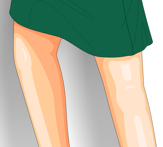
Click image to zoom in
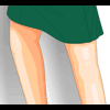 | | Why, you may ask, do we bother to shade the legs when they won't be
seen? Two reasons: First, they're quick and easy to shade; and second
--- and more importantly --- if they're shaded, we have more flexibility
about how the image will be composited at the end. If we want Katie to
be smaller or larger, we can resize her safely knowing that the legs
will still look correct if part of them appear in the result.
So how do we shade them? Bright spot at the knees; shadows in the back;
shadows where the skirt blocks the light; and a bright streak down the
one nearest the light source. That's about it.
|
|
| |
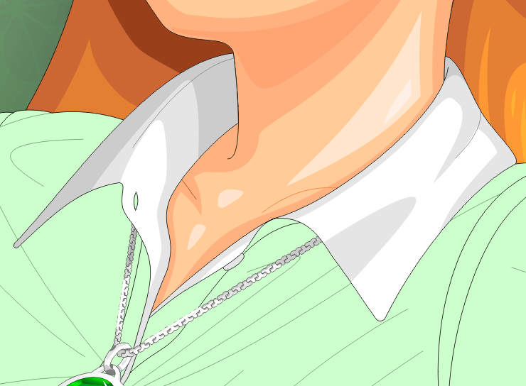
Click image to zoom in
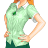 | | 14. Shade the clothes in the next hour or two (or ten)
Alright, the next step is to put shading on all of the clothing. We
know where the wrinkles are --- they were determined when we first
drew the lines for the clothing. All that's left is to project light
from the light source and see what it lands on.
|
|
| |
Click image to zoom in
 | | So we start with something easy and obvious: Her collar. Collars
like this are little more then a cylinder on the inside and a
truncated cone on the outside. There's a shadow at the spot where
it wrinkles in its middle (collars often do that unless you overload
them with starch, and then they look funny). There's shadows on the
back-side and where her neck blocks the light and a little lump of
a shadow where her shoulder blocks the light. And that's about it.
Collars are quick and easy.
|
|
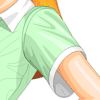
| |
Click image to zoom in
 | | Alright, let's skip ahead. This is what the entire right side of
her shirt looks like shaded. Can you see why? Look carefully.
I'll explain the left side in detail next, but see if you can figure
out why each shadow or highlight is where it is before I do.
|
|
| |
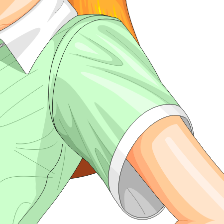
Click image to zoom in
 | | We'll do the left side in detail. First, we darkly shade the parts
that have definite shadows. That's the back side of the shirt, the
area under her sleeve, and under her arm in the sleeve (notice how
we have a brighter spot in that shadow where a little light from outside
is able to seep in), and under her collar.
|
|
| |
Click image to zoom in
 | | Here's the sleeve, fully shaded. Areas below the sleeve are more
smoothly shaded to match the gross shading we did just a few minutes
ago. We add darker areas around all the wrinkles where the light
won't quite reach, and a darker area where the top of her shoulder
blocks the light from hitting the shirt also. Then we add shines
in the middle of the sleeve where the surfaces point toward the light
source. Last, but not least, we take the wrinkle-lines and soften
them to a shade of green that's only a little darker than the shadows
so that they don't distract from the shading.
|
|
| |
Click image to zoom in
 | | Her hand is sitting on she shirt, and will block some of the light.
So we add a shadow under the hand accordingly. More of this area
will get shaded when we factor in the shirt's natural shading, but
it's important to get these "projected shadows" in first so that you
know what areas you don't have to shade later.
|
|
| |
Click image to zoom in
 | | Alright, we've done as much as we can for the easy back-side shading
and the projected shading, and finished the sleeve. Next, we go
through the shirt and add one level of shadow everywhere that is
wrinkly. When you do this, consider both where the shadow-lines were
drawn before and what the shape of the shirt must be doing; if you
look carefully here, you can even see how the shapes of Katie's bra
factor into the shading and curves and lighting here. There's not
that much to say about this stage: If you need to know how to do
this, look at a lot of real fabric under a bright light and see where
the shadows end up. Eventually you'll start to get a feel for
it.
|
|
| |
Click image to zoom in
 | | Once the first level of shading is complete, then you can go through
and add in a second level where the shadows need to be darker: This
is on the back side of the shirt, under the collar, under the hand,
and in any of the deeper folds of the cloth. The first-level shadow
is mostly unchanged here, but there are some minor changes
where it didn't look right before. It's normal to spend a lot of time
"tweaking" the shadows until they look just right as you add each
additional layer.
|
|
| |
Click image to zoom in
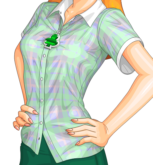
| | Last, but not least, we add in the bright highlights in the larger
open areas between the shadows. These highlights make the shirt look
shiny and expensive; without them, the shirt looks dull and cheaper.
|
|
| |
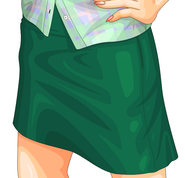
Click image to zoom in
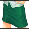 | | If you followed the discussion of the shirt, the shading on the skirt
should be pretty obvious. Darken her right side; add swooping dark
shadows in the middle and left side; add slightly darker spots where
necessary on the bottom and her right side; add a few highlights
where the light strikes directly; and soften the shadow lines and seam
lines to a matching shade of green.
|
|
| |
Click image to zoom in
 | | You're no doubt wondering how I did the plaid. Well, although I'd love
to explain that, it could be the subject of an entire web site by itself,
and my fingers are getting tired after all this explaining. Suffice it
to say that plaid is difficult. A short synopsis is that the plaid
itself is formed of various colored stripes on a blue background; the
stripes are converted to transparency lenses of the correct colors and
opacities, and then the whole thing is smashed down to a bitmap for
efficiency reasons. Then the shadows and highlights on the shirt are
converted into brightening and darkening lenses, the plaid bitmap is
placed under them, and the whole thing is smashed down to a bitmap
yet again. The detail lines, like the shading lines and the seams,
are kept separate to keep them sharp; and then the whole thing is placed
inside a shirt-shaped Powerclip. Drawing the plaid was an exercise in
patience and frustration, and took about ten hours of hard work to get
it right. Don't try this at home, kids.
|
|
| |
Click image to zoom in
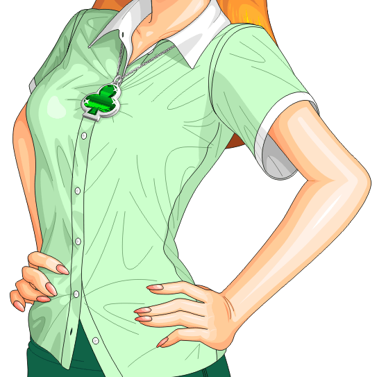
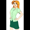
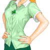
 | | 15. Touch-up and finishing details in the last hour
So what's left? Not much. We have a few touch-up details to finish,
then we have to combine all the bits and pieces together, and then
we do a little pixel magic at the end to make it look nice.
|
|
| |
Click image to zoom in
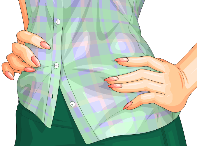
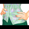 | | First, the minor details. For one thing, her left hand is the wrong
shape, and has been since nearly the beginning. Hands have three joints
per finger, and the joints must be correctly-placed for the hand to
look right. In her index and ring fingers, the second joint was too
close to the tip of the hand, so it has been moved back. Also, her
pinky finger was missing a joint (!). It may look like some of the
fingers here are still missing their last joint, but they still look
correct because they're bending backward slightly at that joint: Hence
their slight outward curve. Also, her fingers on her left hand have
been too thin compared to those on the right, so we thicken them a
little here as well.
|
|
| |
Click image to zoom in
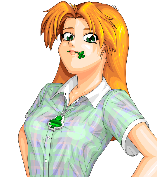
 | | This one is a little embarrassing, but true nonetheless. Her head is
too big. Not by much, but too big nonetheless. So we shrink her head
slightly --- ever so slightly --- and realign her collar to compensate
for the change. Sometimes it can be hard to see these minor errors
in proportion until the end, so be prepared for them, because they
will happen.
|
|
| |
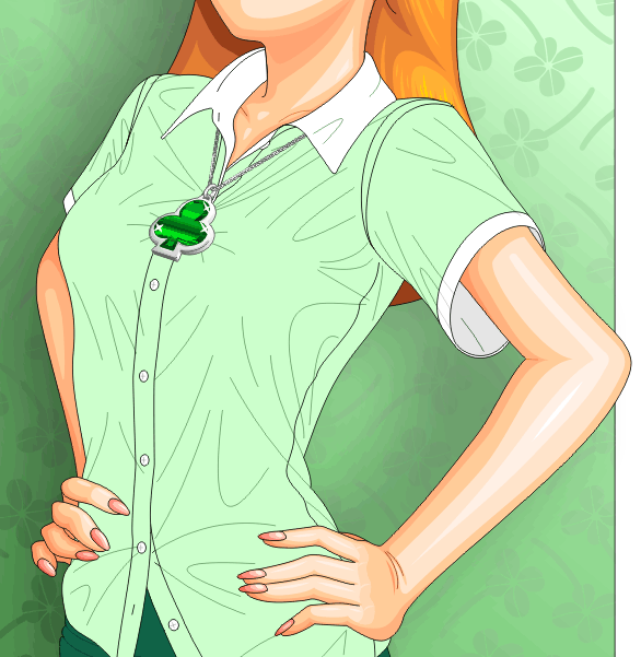
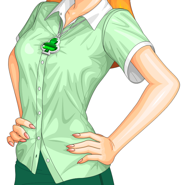
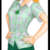
Click image to zoom in
 | | Next, we turn on all the layers and take a look at the finished product.
This is the last chance we have to fix anything that's wrong, so check
carefully to make sure every detail is just right.
|
|
| |
Click image to zoom in
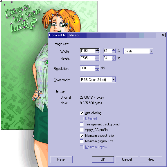
 | | Once you're satisfied that the picture is right, the next step is to
export it to a pixel-based file format. I strongly recommend using
PNG, since PNG will not damage the image and will still compress it
pretty well. Vector art (usually) tends to compress pretty well under
PNG, although we're going to do some stuff soon to the image that will
damage that compression.
How big do you export it? The answer is that you want to export the
image at approximately 7/4 the final size (175%, or thereabouts).
In Katie's case, we want the result to be 768 pixels tall, perfectly
matching a 1024x768 screen. Since the final image will be the same
size as the background, we select just the background, and prepare to
export it: We then find out that it alone will be 576x768 pixels at
34%. Thus 34% is the correct size for the final image. 175% of 34%
is approximately 60%. Thus we go back, select all objects, and
export them at about 60%. You may have to try the export several times
until you get a size that looks good to you; I ended up at around 64%.
|
|
Why, you may wonder, do we do such a crazy thing as export it an exact
percentage larger than we'll actually want it? The answer lies in how
vector-art programs render lines. Most of our lines here are very thin,
and will render at a 1-pixel thickness when exported. One pixel is too
big, though: At that size, the lines will look thick and blocky. So
after we export, we resample it down to make the lines a little over
0.5 pixels thick. We pick the size carefully so that the lines will
be just a little
over 0.5 pixels thick, and not under (which
they could easily be made to be).
| |
Click image to zoom in
 | | So it's in bitmap form now. Open it in Corel Photo-Paint, and take
a look. There are several things that need to be done here. First,
we have gray lines around the picture that are leftover from the black
lines at the edge of the background rectangle. Her skirt and legs and
elbow all run of the edge of the image. And there's a bunch of extra
white space all around the part we actually want. So first, take the
cropping tool and chop the image down to just the part we'll keep ---
which includes the gray line around the background.
Once the image is chopped down to size, we resample it. Personally,
I prefer not to use Corel Photo-Paint to resample, because I
like to know what algorithm is going on behind it. For most people,
it's probably fine, but I'm paranoid about the math. So I copy the
cropped image into IrfanView and use its resampling function to
shrink the image down to 768 pixels tall, and whatever it thinks is
the right width for that --- in this case, 575 pixels wide, which is
one less than we'd guessed. Pretty close, though, for guesswork.
Copy the image back into Photo-Paint for the next set of steps, though,
because it has much better image-retouching tools than
IrfanView.
|
|
| |
Click image to zoom in
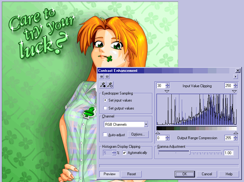
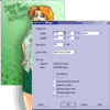
 | | Next, we need to color-correct the image. So far, we've been using
the colors we thought were appropriate, but by just playing with a
certain filter, we can make them much more vibrant. Pull down the
"Image" menu, and click "Adjust" and "Contrast Enhancement". You'll
get a dialog that looks like this.
See the graph? That shows what ranges of brightnesses you're using
and by how much; darks are on the left side and brights are on the
right. This image has pretty good brightness distribution for the
most part, but you can see that we're not really using the full
spectrum: Our blacks aren't their blackest and our whites aren't
their whitest. So grab the two arrows at the top and drag them
toward the center to make the image use more of the range. You
probably don't want to fill the whole range, but some improvement
doesn't hurt. Here, you can see I'm using an input range of 30
to 250; I could go as far as 60 to 247, but that makes the colors
look a little too vibrant. Once you've got a range that
looks good, hit OK and we can move onto the next step.
|
|
| |
Click image to zoom in
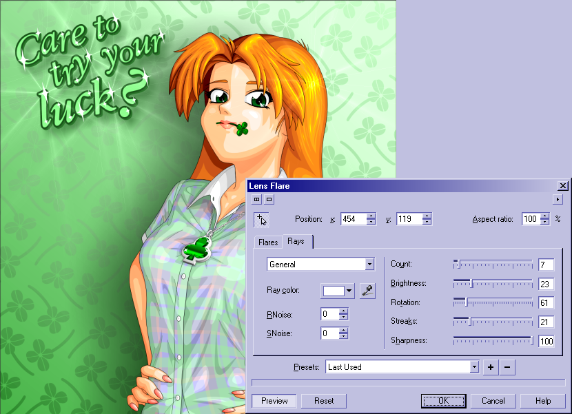
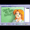
 | | And now, it's time for fun with lens flares! There are things here
that are supposed to be very shiny: The text, the pendant, and her
hair. So on each, we put a little lens flare to make it look extra
shiny. You'll have to play with the exact settings to get it the
way you want it, but this step isn't too hard, and is largely
unnecessary for a lot of images --- but important here.
|
|
| |
Click image to zoom in
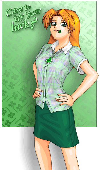
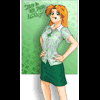
 | | All the details are in place. All that's left is to finish it.
First, draw a one-pixel-thick black line around the outer edge to
cover up the varying gray border and the fact that her legs aren't
really inside the image. Have some fun with the text tools to add
suitable copyright information at the bottom in an unobtrusive way,
and then finally save the whole thing as a nice PNG file. Are
we done?
|
|
Almost, but not quite. There's one stage left: Compress it for
the web. Ideally, we want the image to be as small as possible,
which will mean people can get it faster and we'll save on
bandwidth costs too. However, it's not quite that easy. First,
we have to pick a suitable format: PNG? JPEG? GIF? Something
else?
Each format has its drawbacks. PNG will give us a perfect representation,
but doesn't compress as well as the lossy formats, and not all browsers
can handle it. GIF works everywhere, but is only 256 colors, so it'll
probably be ugly for anything complicated (like Katie). JPEG works
everywhere, but it's lossy: It compresses well, but does so by dropping
"unimportant" parts of the image --- in this case, the nice vivid colors
and sharp edges we worked so hard to produce. The best choice would
probably be JPEG 2000, which compresses well and can still handle sharp
edges and vivid colors --- but almost nothing supports that yet. So in
this case, PNG it is.
| |
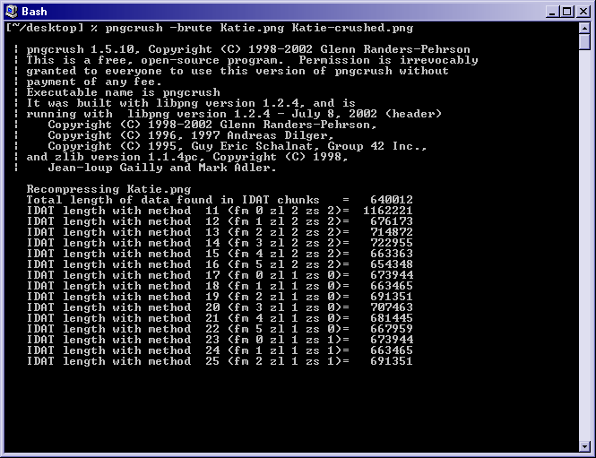
Click image to zoom in
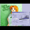
 | | When dealing with things like JPEG, you pick a quality level (like 95%)
and that determines the size of the image; however, with PNG, you simply
save it and hope. However, PNG actually has many compression options,
and most programs will not save PNG as efficiently as they could. Thus
you can use the pngcrush tool to pack the PNG down just a little more
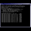
--- without losing any quality. In the above picture, I'm running
pngcrush on Katie, and by the time it's done, it's shaved an impressive
7.38% off the size of the image without losing a single pixel.
|
|
|
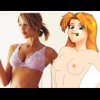
And thus, at long last, after an exhausting 40-50 hours of work,
we're done. You can see the final image by clicking on this thumbnail. |
 |
<< Prev: Part II: Drawing The Body
Copyright © 2003-2017 by the Phantom Inker. All rights reserved.